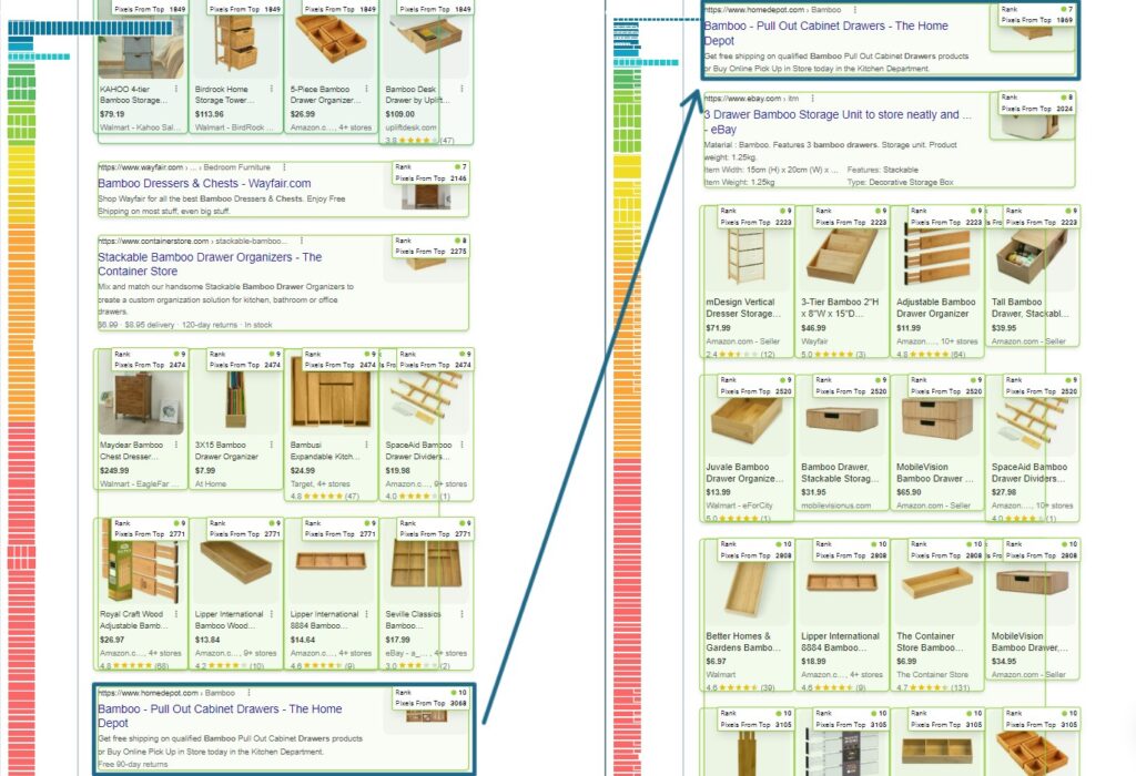
Here’s one feature you don’t want to miss—and it’s perfect for a search engine position report!
With Nozzle, you can view the full Google SERP HTML for any single keyword.
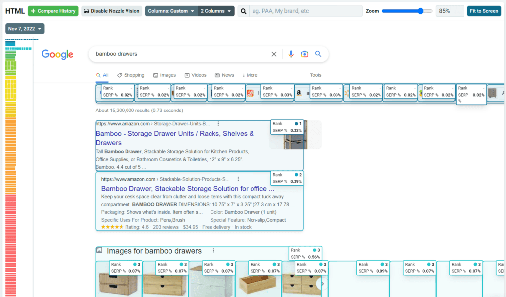
But that’s not all. You can compare the HTML from several dates to get a visual idea the SERPs across. This can be an extremely useful tool for identifying changes in the SERPs over time, such as the placement of PAA boxes, the content of featured material, the text in the descriptions, the quantity of results, or just regular rank.
Using this visual comparison in conjunction with the keyword ranking data Nozzle provides, you’ll have the resources to spice up your search engine ranking report that you share with your clients or boss.
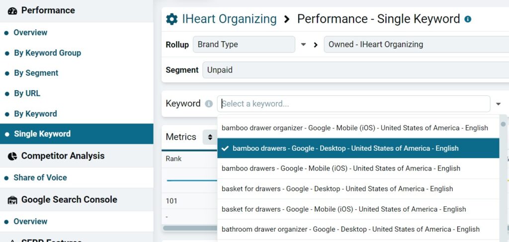
To use this feature, visit the Single Keyword dashboard under Performance, then select your keyword. Scroll down to the SERP HTML section.
You can compare SERP HTML from as many dates as you like using the Compare History button, although 4 or fewer is the best to avoid clutter. Using the Zoom bar and Fit to Screen button in the menu above the SERP HTML, as well as the horizontal scroll bars at the bottom of the page, you can adjust your view of the SERP HTML to fit your needs. Use the date drop down lists to select the dates you want to compare. You can also play around with Nozzle Vision and its Columns controls to display the data you need.
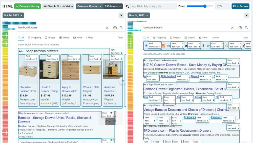
Being able to view the SERPs for multiple dates side by side is super helpful for SEO ranking reports and presentations, especially for reputation management campaigns. Just pull up your SERPs from the applicable dates in our tool to show your clients how effective your campaign has been in lowering the negative results. This visual representation will be more powerful than just a list of ranking changes for each result.
Maybe you want to convey to your boss just how beneficial your SEO efforts have been and how much of a difference a small ranking change has made. Nozzle Vision is crucial here. In the example below, a ranking boost of 3 (from 10 to 7) resulted in a boost of over 1,000 pixels closer to the top of the page! The visual presentation is mind-blowing and definitely beats regular rank reporting.
