Nozzle Dashboards Overview
Nozzle has a variety of dashboards that deliver important insights. This is a quick tour of the dashboards.
Contents
Nozzle has
several well-equipped dashboards
. Each one allows you to see your SERP data from a different angle.
You could use different dashboards to analyze data for a single brand or explore the complete SERP landscape. You can keep tabs on your competition or focus on how you are performing in different SERP features.
The following explores the anatomy of Nozzle dashboards, from the general to the specific.
- Navigation
- Switching Projects
- Date Range
- Focus Dropdown
- Segment Dropdown
- Keyword Group Dropdown
- Sorting, Metrics, and Change vs. Value
- Exporting your Data
Basic Dashboard Functions
Navigation
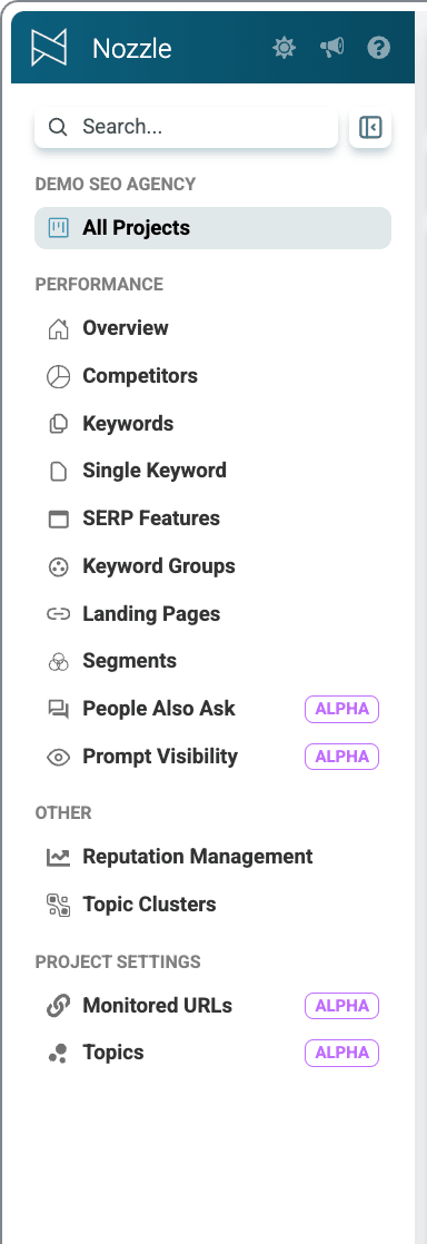
You can navigate to your desired dashboard for any Project from anywhere in the app. Simply click the
All
Project
s
button in the left-side navigation, then click on the Project
name
, or the Overview Dashboards button to go to the Performance
Overview
.
Alternatively, you can select the
Keyword Groups
,
Top Brands
, or
Keywords
links in your project summary to go directly to those dashboards.

If you are already viewing a dashboard, use the
left navigation panel
to switch to another dashboard.
Switching Projects
Click on the project name at the top of the page to switch to a different project
.
You'll see a dropdown where you can select the Project that you would like to view in this dashboard.

Date Range
In the top right-hand corner, you'll see a blue button showing the current date range for which you are viewing data.
Click the date button, then enter or choose a date range in the pop-up and select the green Apply button to change the date range.

Focus Dropdown
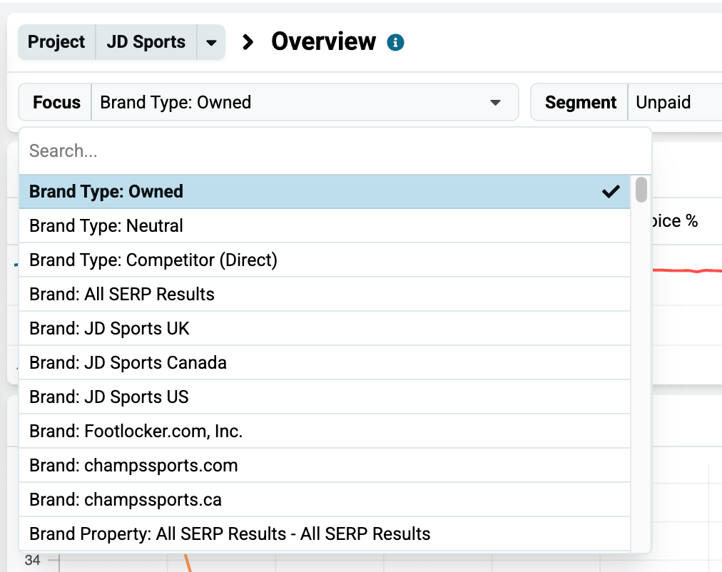
Use the Focus dropdown to choose whether you want to view SERP data for Brands, Brand Types, Brand Properties, Domains, or URLs. (Click here for a definition of all those Focus options.)
In the field next to your chosen Focus, select a specific brand, domain, etc., to see its data.
Segment Dropdown
Use the Segment dropdown to filter your data in any way you can imagine using built-in and custom segments.
To create a custom segment, see this article.

\
You can find details on what each segment does by clicking the Manage Projects button at the top right of any page, or the Settings Cog next to a Project's name on the All Projects Dashboard, and then selecting Manage Segments.
This will take you to a page that displays a table that has each segment's description.

Keyword Group Dropdown
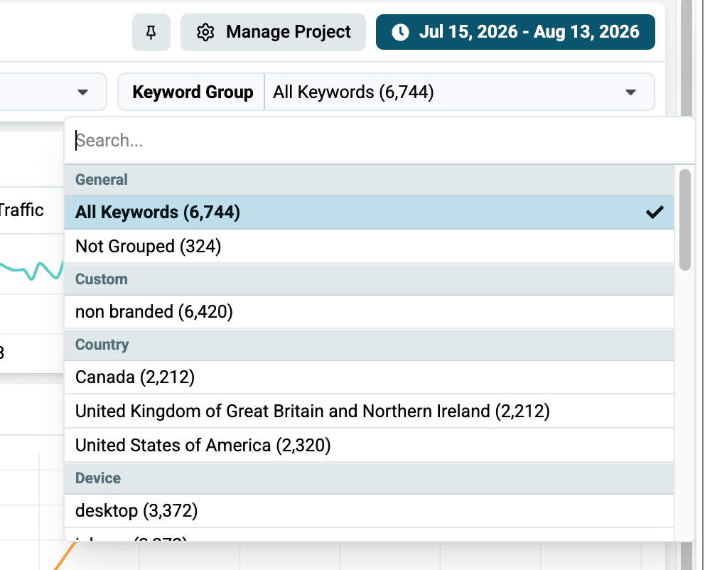
Use the Keyword Group dropdown to filter by your custom keyword groups or use one of our preset groups.
Sorting, Metrics, and Change vs. Value
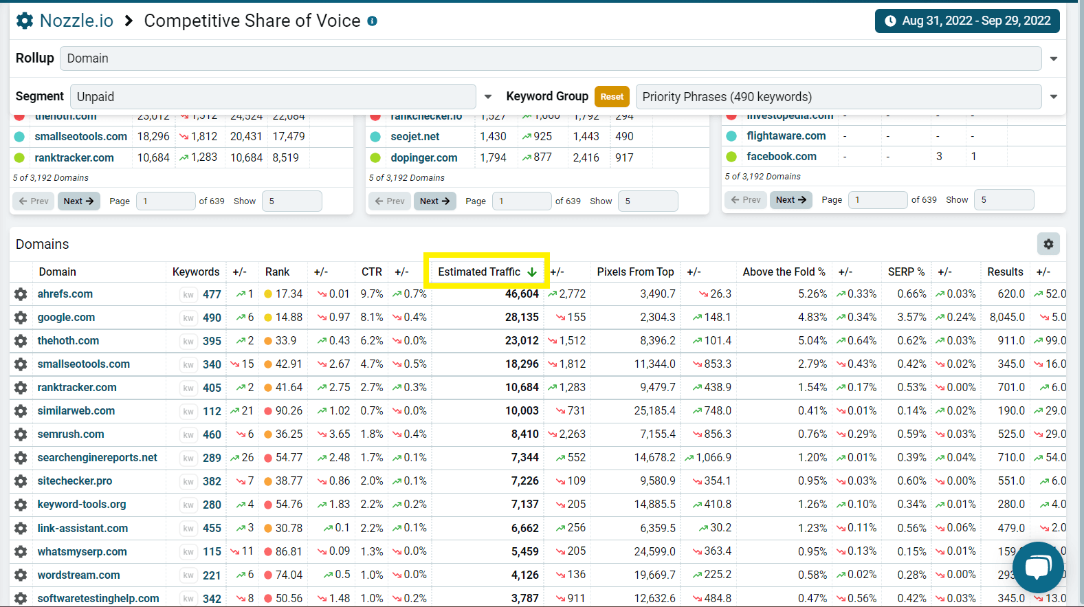
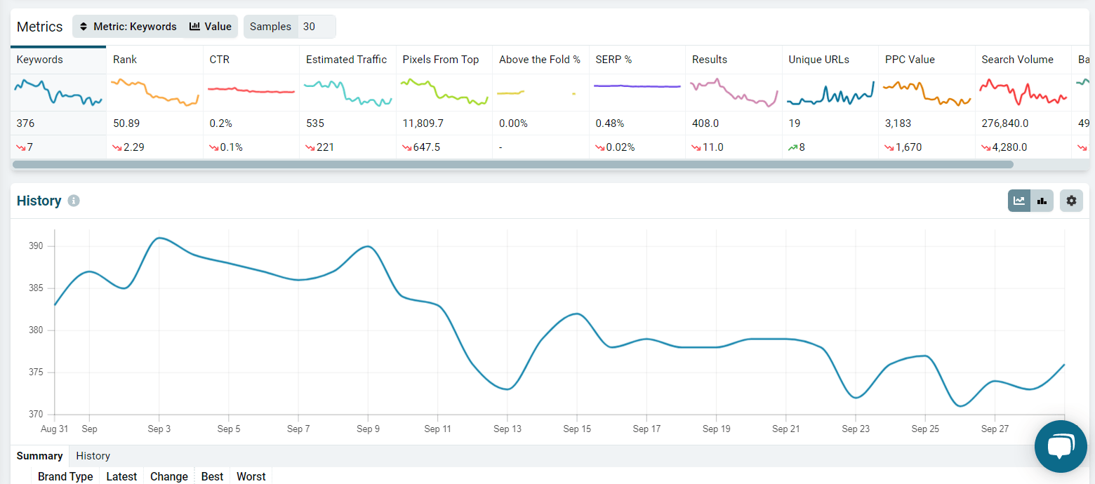
Below the Segment and Keyword Group dropdowns, you'll find a number of Metrics and charts with an overview of their performance. You can click on any of these to sort your data by that specific metric.
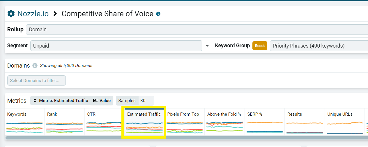
You can also click the metric heading of any column in the data table at the bottom of the dashboard to sort by that metric and toggle between ascending and descending order.
Exporting your Data
Click the menu button in the top right-hand corner of any table to open the menu options. This is where the Export Data button will appear. (Get more details on exporting here.)

\
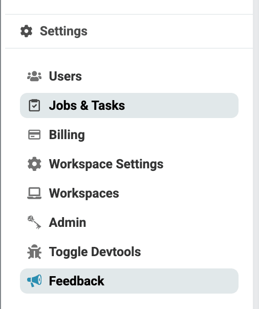
As soon as your export is complete, you will get a notification above in the header. You can click that green notification bar to start the download. Otherwise, click on Jobs & Tasks to open your most recent downloads**.**
* *
*
Charts and Tables
The History chart in the Project Overview dashboard is a great place to start examining your data. Select different metrics to see how they have performed over time.
On the Performance Overview Dashboard, you will also see these four charts:

You can see an overview of these dashboards here, or you can click on the Keyword Groups, SERP Features, Competitors, or Landing Pages titles to go directly to those dashboards and learn more. (You can also use the menu on the left to reach the same dashboards.)
On the Keyword Groups, SERP Features, Competitors, Landing Pages, and Keywords dashboards, you will see a chart where you can toggle between Top, Winners, and Losers for your keywords, keyword groups, landing pages, segments or competitors. These are the Top performers as well as the ones that had the most positive movement (the Winners) and the most negative movement (the Losers).

Below the charts, at the bottom of most dashboards (or right in the middle of your Overview dashboard), you'll find a table where all the data is summarized and ready for you to sort and explore.
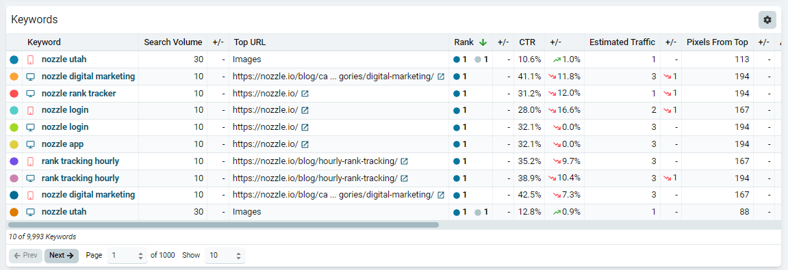
Click on the brands, domains, URLs, keywords, or groups in these data tables to further analyze them.
Nozzle Vision
In the Single Keyword dashboard, you can analyze a SERP results with Nozzle Vision.
This is a complete re-render of the SERP HTML from the selected date so you can confirm your results, see the metrics put right on the page, and even compare different days' results.

Specific Dashboard Functions
Along with the basic functions outlined above, Nozzle dashboards contain additional options, depending on their purpose.
Click on any of the following links to learn about the purpose and functions of a specific dashboard.
Performance
Metrics
With all the added features that now appear on the SERPs, rank alone is no longer a sufficient metric for understanding the SERP.
We display data for a ton of metrics to give you the best SERP tracking experience possible.
These metrics include:
- Rank
- Pixels from Top
- Clickthrough Rate
- Above the Fold Percent
- SERP Percent
- Estimated Traffic
- PPC Value
- Keywords
- Unique URLs
- Results
- Search Volume
- Base Rank
- And more
Learn more about our unique metrics—why we use them, how we calculate them, and more—on our metrics page.
👍 Now that you know the basics of Nozzle dashboards, it's time to start eating up that data! Good luck!
Related articles